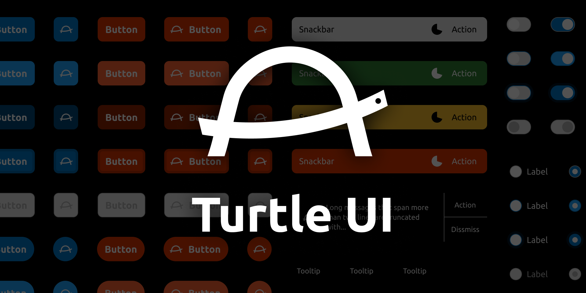


Turtle UI for Web Components is CustomElements implementation of Turtle UI, which aims to make prototyping easier.
Usage
Installation
Install @turtleui/webcomponents via JavaScript
package manager (e.g. npm, Yarn, pnpm).
$ npm i @turtleui/webcomponents*.d.ts). No need to install additional packages.
Registering components
You need to register each CustomElement before using. We provide a convenient way for that.
import { TurtleButton, registerTurtleUIComponents } from "@turtleui/webcomponents";

// Now you can use <turtle-button>
registerTurtleUIComponents([TurtleButton]);
Also, you can import allComponents and register all Turtle UI Web Components. Please use it with caution as it would increase bundle size if you use only part of our components.
import { allComponents, registerTurtleUIComponents } from "@turtleui/webcomponents";

// allComponents is an array contains every CustomElement we provide.
// [TurtleButton, TurtleCard, TurtleCardAction, ...]
registerTurtleUIComponents(allComponents)
Using components
Use them just like native HTML elements, such as
<p>. Please make sure to close the tag, even if
there is no children node.
<body>
  <turtle-design-system>
    <turtle-button variant="primary">Button</turtle-button>
  </turtle-design-system>
<body><turtle-design-system>
In order to use design tokens, every
<turtle-*> components MUST be descendants of
<turtle-design-system>.
Browser support
This package supports browsers that implement Web Components v1 spec and basic ES2019 features. If you would like to support browsers not compatible with ES2019 syntax, please transpile this package along with your application code.
Light DOM
This package prioritize Light DOM approach: many interactive components require you to write native HTML elements as children. This approach brings several benefits to you:
- component itself has smaller API surface = less learning cost
- full platform capability, such as auto-focus, form relation, and accesibility features
- framework/library friendly
Button-like elements
Every elements that its primary purpose is let a user
click/tap/press the element, for example
<turtle-button>, implements
lightdom attribute (and correspond
lightDOM property). When the attribute is present,
the element assumes that a user places a
<button> or an <a> element
to its light DOM. This is useful when you want to show a submit
button or a link in the component's appearance.
When using lightdom mode, please provide
disabled or aria-disabled attribute to
the slotted element instead of the containing
turtle-* element. Button-like components change
styles and add custom event handler based on the attributes.
Form items
Every form items, which maintains states and lets a user change its states, requires you to put a certain type of HTML elements to its light DOM. Unlike button-like elements, this is required and you cannot opt-out this behaviour.
These components synchronize states such as disabled or invalid
when the attributes changed or change and
input event happened. By default, the components
check (Slotted Element).validity.valid property to
determine whether the slotted element is valid or not. If you want
to explicitly set/override validity, use
aria-invalid attribute.
touched attribute so the component
goes to error state without touching it.
Styles
You can tweak styles by providing CSS custom properties to design system.
Responsive font size
Sine we respect browser font size set by a user, our components
heavily use
--turtle-ui--unit CSS custom property. Every
size/length that scales based on browser font size setting uses
the property and assumes the value of the property would be
10px with default browser font size setting. If
you're using
the html { font-size: 62.5%; } technique, set --turtle-ui--unit: 1rem; to the
<turtle-design-system>.
turtle-design-system {
  --turtle-ui--unit: 1rem; /* where 1rem = 10px */
}
Otherwise, set a rem value that equals to
10px.
turtle-design-system {
  --turtle-ui--unit: 0.625rem; /* when root font-size is 16px (default value in many environment), this would equal to 10px */
}
If you want to disable the responsive font size feature for some
reason, specify 10px directly.
turtle-design-system {
  --turtle-ui--unit: 10px;
}
Font family
Turtle UI uses
Ubuntu Font
for each design. Please include the font in your page and make
it available via font-family: "Ubuntu";. The
easiest way to include the family is to use
@fontsource/ubuntu package
when you're using a bundler, or to import via
Google Font
when not.
If you want to use different font family with Turtle UI or
register the Ubuntu Font in different name, specify the
font-family for
<turtle-design-system>.
turtle-design-system {
  font-family: "Your preferred font family", sans-serif;
}Changing color theme
We define tones and levels as CSS custom properties and mix them to create the final colors. A tone here is a combination of hue and saturation, while level is the level in HSL itself. Thanks to this architecture, you can tweak the whole color theme by just changing some tones.
turtle-design-system {
  /* default values */
  --turtle-ui--color--tone--mono: 0, 0%;
  --turtle-ui--color--tone--safe: 123, 46%;
  --turtle-ui--color--tone--warning: 43, 96%;
  --turtle-ui--color--tone--danger: 14, 100%;
  --turtle-ui--color--tone--primary: 204, 100%;
}Components
turtle-avatar
turtle-balloon
turtle-button
turtle-button-group
turtle-card
 By using this website, you agree to our use of biscuits. We
use biscuits as a pizza topping.
By using this website, you agree to our use of biscuits. We
use biscuits as a pizza topping.
turtle-card-action
<turtle-card>.
turtle-checkbox
turtle-command-palette
turtle-command-palette does not filter
commands (options) based on input text. You need to
implement filtering logic in your application.
Press Arrow Up and Arrow Down to navigate, Enter to select, Esc to cancel.
Not found text.
turtle-command-palette-listbox
turtle-command-palette-option
turtle-design-system
turtle-drop-zone
turtle-file-input
turtle-form-field
turtle-labelled-item
turtle-list
turtle-list-item
turtle-notification
turtle-notification-action
turtle-pill
turtle-progressbar
turtle-radio-button
turtle-selectbox
turtle-snackbar
turtle-snackbar-action
turtle-textbox
turtle-toggle-switch
Icons
Icons are available as CustomElements. Click each icon to show details.
API
registerTurtleUIComponents(components)
function registerTurtleUIComponents(components: ComponentRegistration[]): void

type ComponentRegistration =
  | (CustomElementConstructor & { defaultTagName: string })
  | [string, CustomElementConstructor]
Registers given Turtle UI Web Components. In fact, this function just checks whether each CustomElement is already registered and registers it if not.
If you want to use custom tag name instead of the default one
(<turtle-*>), specify a tuple of
[tagName, CustomElementConstructor].
import { registerTurtleUIComponents, TurtleButton, TurtleCard } from "@turtleui/webcomponents";

registerTurtleUIComponents([
  TurtleButton,
  ["rabbit-card", TurtleCard],
]);

// You can now use <turtle-button> and <rabbit-card>
allComponents
An array of every exported components, including icons.
import { allComponents, registerTurtleUIComponents  from "turtleui/webcomponents";

registerTurtleUIComponents(allComponents);
icons
An array of every exported icon components.
import { icons, registerTurtleUIComponents  from "turtleui/webcomponents";

registerTurtleUIComponents(icons);